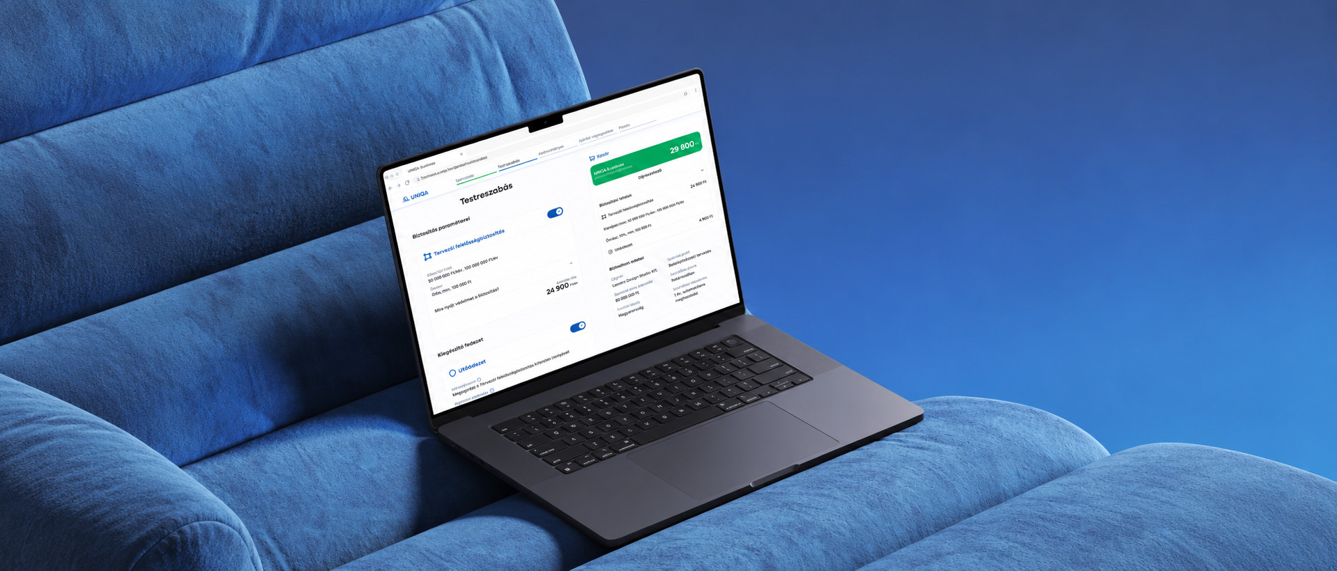
MagNet Bank

Deciding how far to modernise a community bank’s app

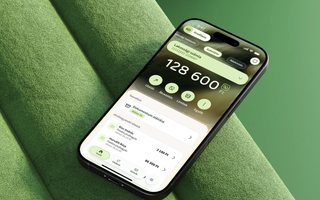
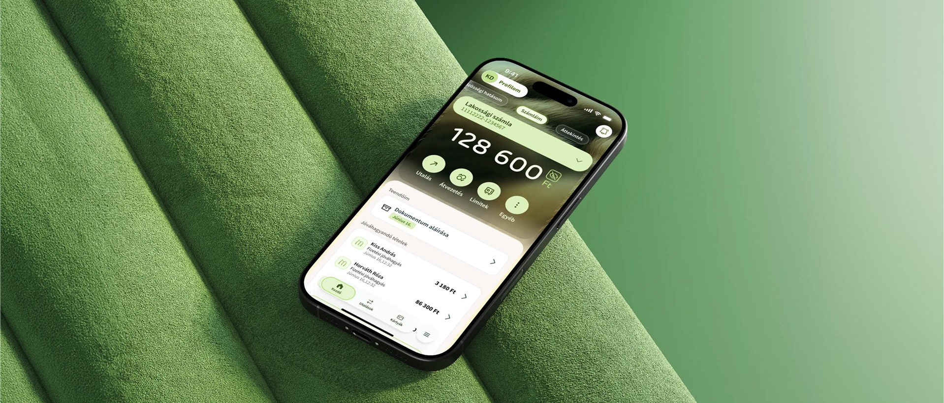
MagNet’s New UI home screen on a phone, tilted on green velvet.
Client
MagNet Bank · via Stereogram Studio
Role
UI design · Design system audit · Prototype
Year
2026
Team
Lóránt Valaczka (UI) · Csilla Varga (UX)
Duration
August–September 2026
Platform / scope
Mobile app

Community bank · Since 1995 · 60,000+ customers · 28 branches

Client project as part of Stereogram Studio

My role

Product designer via Stereogram Studio. I audited the design system, designed the home screen in two directions, did the handoff and built the motion prototype.

Problem

MagNet’s app looked dated next to its bolder web brand. The bank wanted a new home screen, but wasn’t sure how much to change.

Approach

Audited the system, redesigned the home screen in two directions on one structure, and made both scrollable on the decision makers’ own phones.

Key insight

The system was sound; the real question was how much of the brand to let into the app.

Impact
  • 850 components audited against WCAG 2.1 AA in three weeks: 47 findings, one critical, no rebuild needed
  • Two directions, Standard and New UI, that the bank can ship in steps, Standard first, without touching other screens
  • A coded prototype the bank could scroll, not a deck to read
  • Delivered in full; MagNet is now planning implementation and working through the audit
Timeline

August–September 2026

Skills

Design system audit · Accessibility (WCAG 2.1 AA) · UI design · Handoff · Motion prototype · AI-assisted reporting
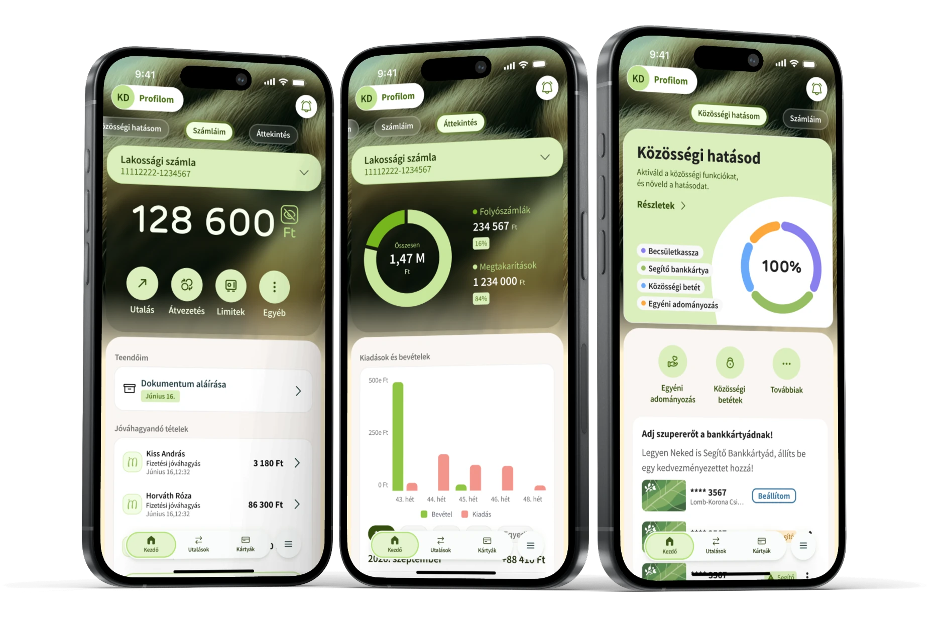
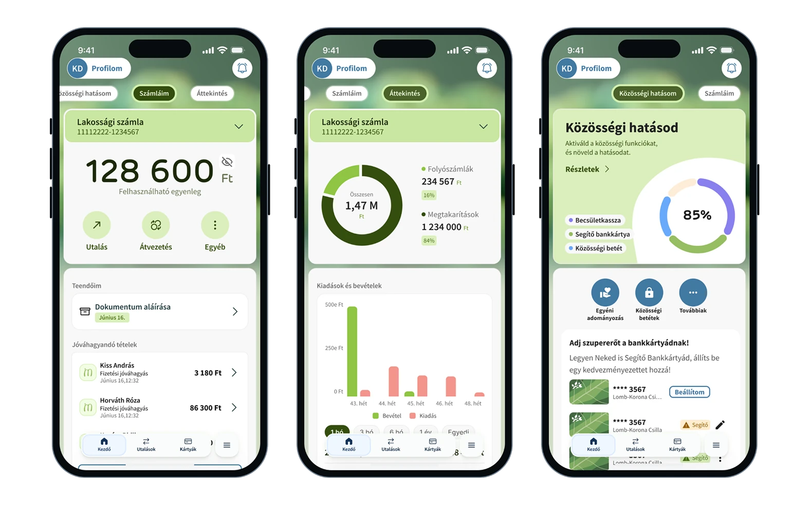
Three phones side by side showing MagNet’s new home screen in its three functions: Accounts with the balance and quick actions, Overview with income and spending, and Community impact.
Three functions: Accounts, Overview and Community impact.
Inputs

Benchmarks of competing bank apps, mainly Revolut · patterns from Mobbin · consulted: András Pop, Stereogram’s founder, and the MagNet team

Starting point

The brief was a new home

Its website says so, boldly

MagNet is a community bank: its customers decide where part of the profit goes and what their deposits are used for. Its website says so, boldly. Its app didn’t.

It ended up setting the question

The brief was a new home: three hubs, Accounts, Overview and Community impact, and the navigation between them. An audit of the design system was attached, almost as a formality. It ended up setting the question.

Today’s app, where every session starts, next to the live magnetbank.hu.
Audit

The audit answered a different question

No rebuild needed

I checked every component against WCAG 2.1 AA, colour pair by colour pair. The one critical finding was the app bar, where the brand green left the navigation short of contrast. The fix is at token level.

The finding that mattered wasn’t on the list

The app felt generic next to MagNet’s web brand, and nothing in the system stopped it getting closer. The question became how far to go.

AI in this project

I wrote the findings; Claude built the report as an interactive page, filterable by severity and area.

The web’s brand and the app’s system: how far should the app move?
850components audited
47findings, 23 on accessibility
1critical
UI & handoff

One screen, the rest untouched

Leave the rest alone

Modernise the app through the screen every session starts on, and leave the rest alone. Our UX colleague, Csilla Varga, led the research and wireframes; the structure came out of that work: three hubs and a top-bar navigation.

We knew what the system allowed

The audit ran alongside the UX phase, so by the time UI started we knew what the system allowed. The handoff covers every state, versioned, and leaves the other screens as they are.

From today’s app through the wireframes to two directions on the same three hubs.
Home screen

Two directions instead of one

We designed the screen twice on the same structure

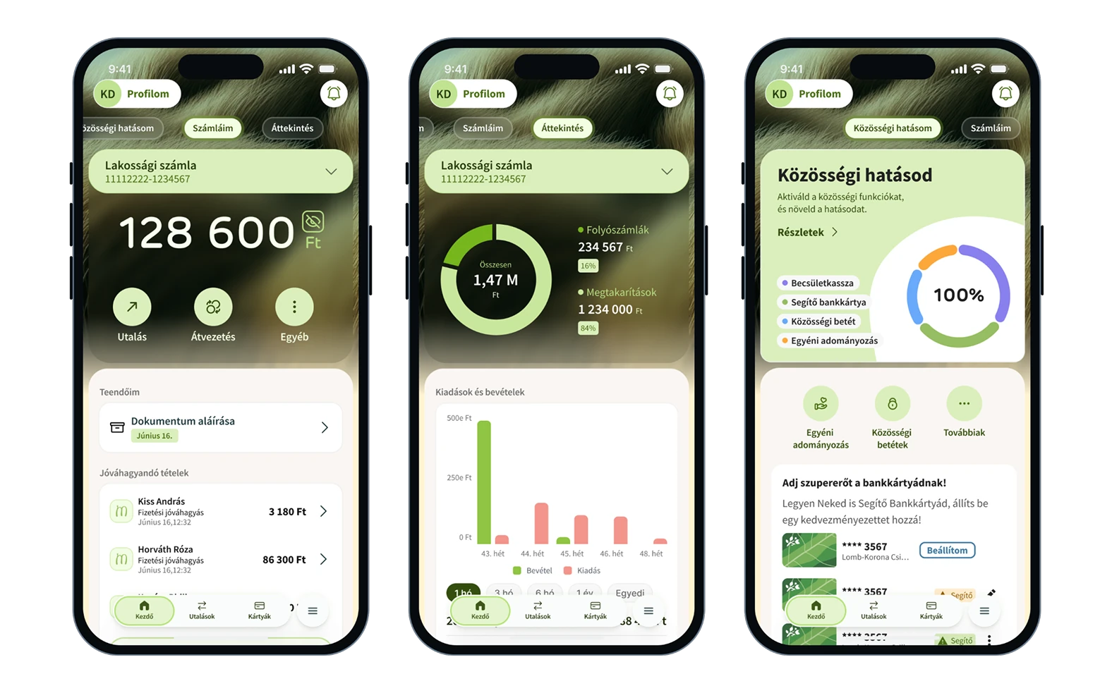
Once the question became how much brand to let in, a single design would have made that decision for the bank. So we designed the screen twice on the same structure: Standard, on the current design system, and New UI, closer to the brand.

The audit changed the question

We propose Standard first, a smaller step on the existing system, and New UI when the bank is ready for a bigger change.

Prototype

A decision you can scroll

Decision makers scrolled it themselves

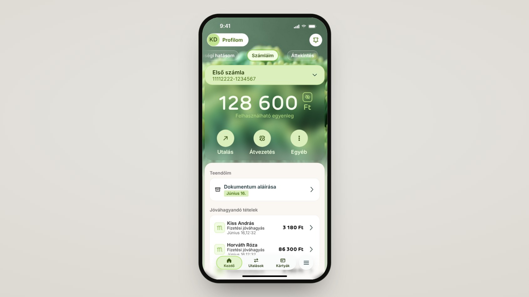
Motion and patterns live in a designer’s head, and static frames can’t carry them to the people who decide. So I coded the home screen with AI, scroll-driven, with a switch between Standard and New UI, and sent the link. It was well received, and we handed everything over.

Most important impact

One MagNet colleague said they’d switch to MagNet themselves if the app looked like this.

The prototype as the decision makers scrolled it, here in the New UI.
Closing

How it went

My part, and what comes next

Role

The design system audit, the home screen in two directions, the handoff and the coded prototype.

Team

Lóránt Valaczka, UI · Csilla Varga, UX · András Pop, Stereogram’s founder, consulted

Next

MagNet is now planning implementation and working through the audit findings.

The full storyPortfolio deckThe complete case, slide by slide.Open →

Next case